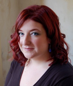
So I had my author photos taken and I didn’t have to resort to booze. Â It was actually a tremendously fun experience, and I have Robert Trudeau, Talbot Trudeau, and my friend Jennette Ginsburg to thank for that.
I’ve narrowed down the choice to four, two of which are sorta the same. Â But different! Â
Which do you like? Â What’s your advice?
Here they are, in no particular order.
This one I like to call preternatural chic:

Then we have naughty with a hint of demure:

Or demure with a hint of naughty:Â

And finally, the pacific profile:

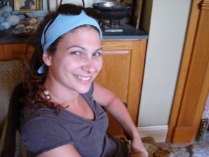
Help! Â Which should I choose? Â Or should I just use Jennette’s photo as she is WICKED HOT:

Would you mind being my author-photo-stand-in, Jennette?
Post YOUR pick in the comments. Â Thanks!
I love the second one. It looks so professional.
1st: pacific profile
2nd: demure with a hint of naughty
I love your hair!
Your hair looks amazing!
I like the second one the best, with the fourth one close behind.
#2. Classy with sassy undertones. It looks like you're about to give us a saucy wink. Perfect.
I like number four. All wistful and distant, like you're looking at a far away world.
i LIKE NAUGHTY WITH A HINT OF DEMURE
I also have to agree that your hair is so pretty! Great photos!
And I vote for #2!
I like the two middle pics the best. Love the hair. Nice low lights too!
I'm casting my vote for the first. Not only does it have that beautiful, slightly jarring quality, but you look the happiest in it…I don't know; it just seems more of 'you' spills out of the first one.
–Amethyst
I like the second one the best!
#2 is my favorite. 🙂
Thanks guys!!!
Amethyst: I LOVE your declaration on your website. Labyrinth is one of my all time favorite movies and I LOVED David Bowie when I was a kid. Everyone else liked NKOTB and I wanted the dude in the grey spandex.
So not much has changed. 😉
And my hair IS amazing, I'm really pleased with it. It's not mine, someone else did it, so I can say that. 😉
Demure with a hint of naughty.
Number one. Totally. The shadows on your face in the rest of them will look extra-dark when shrunk and put on a book jacket. Besides, the first one gives the best showcase for that wicked-awesome hair you've got going on 🙂
The second one: Naughty with a hint of demure.
Looks professional and gorgeous at the same time!
I like demure with a hint of naughty.
I vote Photo #2: Naughty with a hint of demure. Or Jennette will suffice 😉
#1 looks a little unearthly which is cool, but less professional due to the background. #2 is great re your personality that we've seen in blogs (plus it's a gorgeous photo). #3 I like the lighting but you look a little restrained. #4 is my favorite photo overall and the best re look and lighting. If there's any problem with it, it's that you're not having eye contact with whoever sees it. Personally I think that's just fine for fantasy/UF authors but others might prefer you seem more accessible.
I think #4 is gorgeous and hints at all sorts of things (mysterious & magical + gorgeous). It'll also look really great at all sizes but if you want an eye contact photo then I'd pick #2 – naughty with a hint of demure.
Good luck! Whichever you choose, you'll look fabulous! (I have hair envy) 🙂
#2 is perfection.
#2 for me, too. Great pics, Nicole! Love the red. 🙂
I like 1 and 4. You can always have the background in 1 photoshopped out. I notice you're wearing my earrings, though. I'm not sure how I feel about that…
Definitely #2.
And I am utterly in love with your hair 🙂
You all have such good logic! I now want to use 1, 2, and 4!
AAAGH!
Or just be Jennette! Her dreads are WIKKID!
Hint of Demure. 🙂
clearly no. 3. There is a little Mona Lisa over that smile.
Naughty with a hint of demure. No question!
No. two without a doubt.
Pacific Profile. You look gorgeous.
I vote #1. You make eye contact in a way that you don't in the others. Your gaze is compelling and pulls the viewer in.
I like the 2nd one best, but your eyes are soooooo blue in the first one. I'm jealous.
Thanks Gail. I think it's more a trick of the light, though. 🙂 They are definitely blue, but more greeny/grey blue, usually. My brother's eyes are freakishly blue, like that, all the time. And he got the long eyelashes. Soooo unfair. 🙂